Illustration of the fitting procedure of the normalized \gls{LED} signal for a good cell in \gls{EMCal} (left) and a problematic one in \gls{DCal} (right). The raw distribution obtained for the full 2018 data sample is shown in gray scales in the background, while the maxima in each temperature slice are indicated by green open circles. As there might be multiple clusters of points (as seen on the right) the distribution that is considered as the dominant cluster is marked by black closed circles, while the blue squares represent the shifted distributions after the correction for their offset is applied The final fit to the combined distribution of black and blue points is given as a dashed red line. Points marked in red were iteratively excluded from the fit as they were considered outliers. | 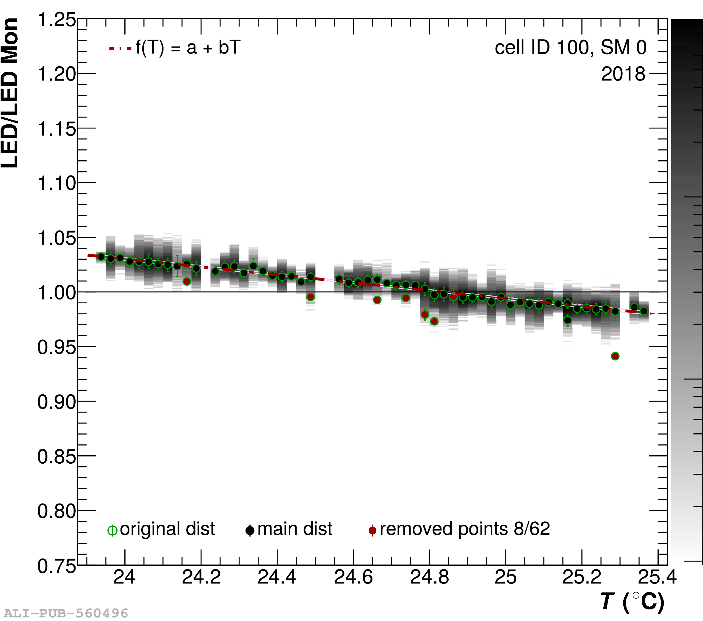 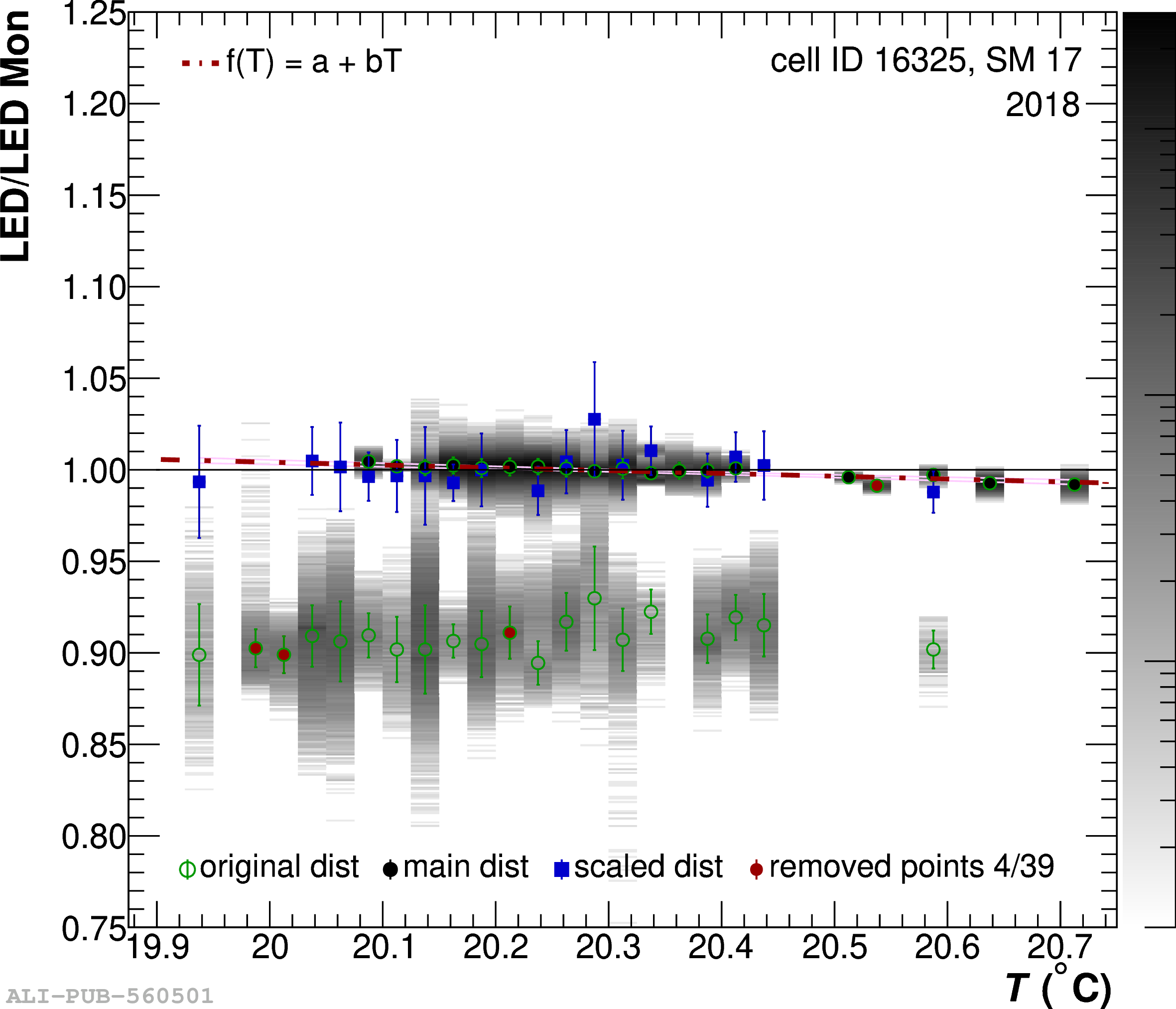 |